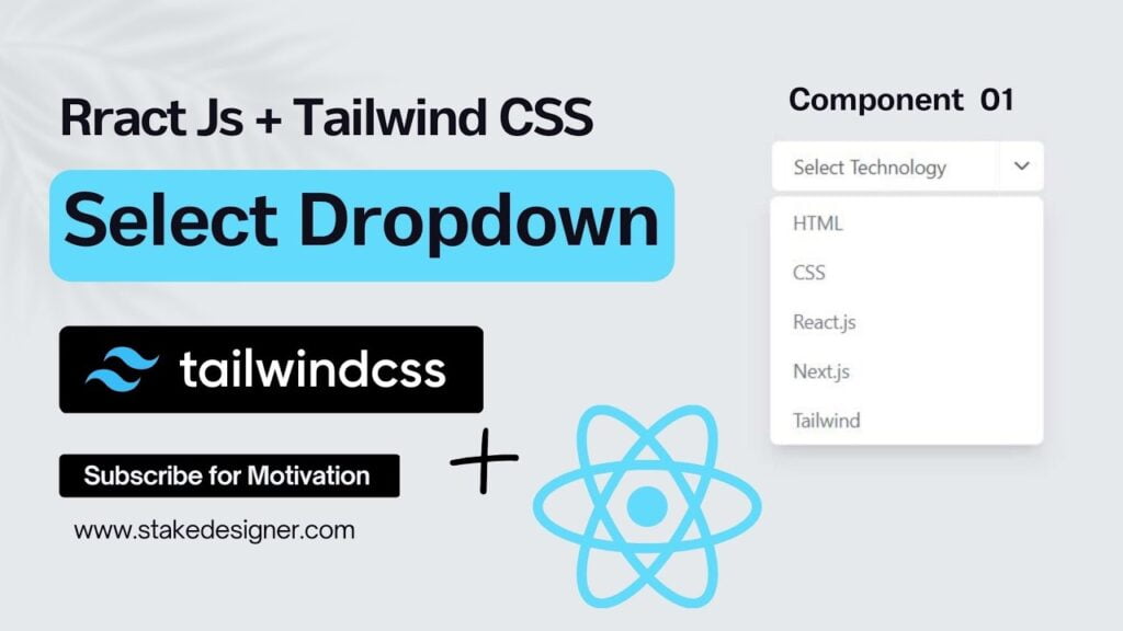
You will learn to How to make custom dropdown using React.js and Tailwind CSS . When you click on the select button your option will appear and you could choose your option and that will appear on your select button.

React.js and Tailwind CSS
How to make dropdown React.js Tailwind CSS
Dropdown menus are a common component in web development, allowing users to select options from a list. In this article, we will explore how to create a custom dropdown using two popular libraries: React.js, a JavaScript library for building user interfaces, and Tailwind CSS, a utility-first CSS framework. By combining these powerful tools, we can design and implement a flexible and customizable dropdown menu.
In modern web development, creating custom UI components is a common task. In this article, we will explore the process of building a custom dropdown component using React.js and Tailwind CSS. By combining the power of React.js for component-based development and Tailwind CSS for efficient styling, we can create a flexible and reusable dropdown that enhances the user experience.
Table of Contents
Prerequisites:
To follow along with this tutorial, it is recommended to have a basic understanding of React.js and Tailwind CSS. Make sure you have Node.js and npm (Node Package Manager) installed on your machine to set up the development environment How to make dropdown.
Setting Up the Project
1.Create a new React.js project by running the following command in your terminal:
npx create-react-app custom-dropdown2.Change into the project directory:
cd custom-dropdown3.Install Tailwind CSS and its dependencies:
npm install tailwindcss postcss-cli autoprefixer
4.Generate the Tailwind CSS configuration file and postcss.config.js:
npx tailwindcss init -p
Building the Dropdown Component:
In the “src” folder, create a new file called “Dropdown.js” and import React:
import React from 'react';

const Dropdown = () => {
  return (
    <div className="relative">
      {/* Dropdown content goes here */}
    </div>
  );
};

export default Dropdown;
Inside the div, we will add the necessary elements to create the dropdown. Let’s start with the dropdown button and its associated list:
<div className="relative">
  <button className="bg-gray-200 hover:bg-gray-300 text-gray-800 font-bold py-2 px-4 rounded inline-flex items-center">
    Dropdown Button
    <svg
      className="fill-current h-4 w-4 ml-2"
      xmlns="http://www.w3.org/2000/svg"
      viewBox="0 0 20 20"
    >
      {/* Dropdown icon */}
    </svg>
  </button>
  {/* Dropdown list */}
  <ul className="absolute hidden bg-white text-gray-800 pt-1">
    {/* Dropdown list items */}
  </ul>
</div>
Next, we need to handle the visibility of the dropdown list. To achieve this, we’ll use React’s state:
const Dropdown = () => {
  const [isOpen, setIsOpen] = React.useState(false);

  const toggleDropdown = () => {
    setIsOpen(!isOpen);
  };

  return (
    <div className="relative">
      <button
        className="bg-gray-200 hover:bg-gray-300 text-gray-800 font-bold py-2 px-4 rounded inline-flex items-center"
        onClick={toggleDropdown}
      >
        Dropdown Button
        <svg
          className="fill-current h-4 w-4 ml-2"
          xmlns="http://www.w3.org/2000/svg"
          viewBox="0 0 20 20"
        >
          {/* Dropdown icon */}
        </svg>
      </button>
      <ul className={`absolute ${isOpen ? 'block' : 'hidden'} bg-white text-gray-800 pt-1`}>
        {/* Dropdown list items */}
      </ul>
    </div>
  );
};
Now, let’s add some dummy data to the dropdown list and map over it to create the list items:
const Dropdown = () => {
  const [isOpen, setIsOpen] = React.useState(false);
  const dropdownItems = ['Option 1', 'Option 2', 'Option 3'];

  const toggleDropdown = () => {
    setIsOpen(!isOpen);
  };

  return (
    <div className="relative">
      <button
        className="bg-gray-200 hover:bg-gray-300 text-gray-800 font-bold py-2 px-4 rounded inline-flex items-center"
        onClick={toggleDropdown}
      >
        Dropdown Button
        <svg
          className="fill-current h-4 w-4 ml-2"
          xmlns="http://www.w3.org/2000/svg"
          viewBox="0 0 20 20"
        >
          {/* Dropdown icon */}
        </svg>
      </button>
      <ul className={`absolute ${isOpen ? 'block' : 'hidden'} bg-white text-gray-800 pt-1`}>
        {dropdownItems.map((item, index) => (
          <li key={index} className="hover:bg-gray-200 py-2 px-4">
            {item}
          </li>
        ))}
      </ul>
    </div>
  );
};
Styling the Dropdown
Open the “src/index.css” file and import Tailwind CSS:
@import 'tailwindcss/base';
@import 'tailwindcss/components';
@import 'tailwindcss/utilities';
Add a custom class for the dropdown list to align it with the button:
.custom-dropdown {
  min-width: 12rem;
}

Add a custom class for the dropdown list to align it with the button
.custom-dropdown {
min-width: 12rem;
}
Apply the custom class to the dropdown list in the Dropdown component:
<ul className={`absolute ${isOpen ? 'block' : 'hidden'} bg-white text-gray-800 pt-1 custom-dropdown`}>
  {/* Dropdown list items */}
</ul>
Conclusion:
In this tutorial, How to make dropdown we walked through the process of creating a custom dropdown using React.js and Tailwind CSS. By combining React’s state management with Tailwind CSS’s utility classes, we were able to build a flexible and visually appealing dropdown component. Feel free to enhance it further by adding animation, additional styling, or integrating it with your existing React.js projects.
More JavaScript Project click


