JavaScript Accordion

JavaScript Accordion: A Step-by-Step Guide
Accordion menus are a fantastic way to organize and display content in a neat and organized manner, particularly for websites with a lot of information to showcase. They allow users to expand and collapse sections of content with a simple click, providing a smooth and intuitive browsing experience. In this step-by-step guide, we’ll walk you through the process of building a JavaScript accordion from scratch.
Understanding Accordions
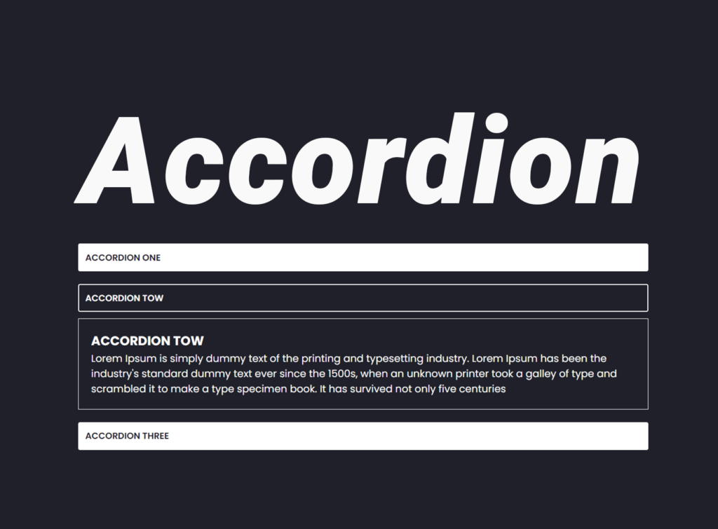
Before we dive into the technical details, let’s briefly discuss what an accordion is and its role in web design. An accordion is a user interface pattern that consists of collapsible panels, typically stacked vertically. Each panel contains a header (or button) and a content section. When a user clicks on the header, the corresponding content expands or collapses, revealing or hiding additional information.
Table of Contents
Step 1: HTML Structure
The first step is to set up the HTML structure for our accordion. We’ll create a container to hold all the accordion items, and each item will consist of a button and a corresponding content section. Here’s a basic example:
 <div class="accordion-container">
      <div class="accordion-item">
        <div data-target="accordion1" class="accordion-button ">
          accordion one
        </div>
        <div id="accordion1" class="accordion-content ">
          <h2>accordion one</h2>
          <p> Lorem Ipsum is simply dummy text of the printing and typesetting industry. Lorem Ipsum has been the
            industry's
            standard
            dummy text ever since the 1500s, when an unknown printer took a galley of type and scrambled it to make a
            type
            specimen
            book. It has survived not only five centuries
          </p>
          <p> Lorem Ipsum is simply dummy text of the printing and typesetting industry. Lorem Ipsum has been the
            industry's
            standard
            dummy text ever since the 1500s, when an unknown printer took a galley of type and scrambled it to make a
            type
            specimen
            book. It has survived not only five centuries</p>
        </div>
      </div>

      <div class="accordion-item">
        <div data-target="accordion2" class="accordion-button">
          accordion Tow
        </div>
        <div id="accordion2" class="accordion-content">
          <h2>accordion Tow</h2>
          <p> Lorem Ipsum is simply dummy text of the printing and typesetting industry. Lorem Ipsum has been the
            industry's
            standard
            dummy text ever since the 1500s, when an unknown printer took a galley of type and scrambled it to make a
            type
            specimen
            book. It has survived not only five centuries</p>
        </div>
      </div>

      <div class="accordion-item">
        <div data-target="accordion3" class="accordion-button ">
          accordion Three
        </div>
        <div id="accordion3" class="accordion-content">
          <h2>accordion Three</h2>
          <p> Lorem Ipsum is simply dummy text of the printing and typesetting industry. Lorem Ipsum has been the
            industry's
            standard
            dummy text ever since the 1500s, when an unknown printer took a galley of type and scrambled it to make a
            type
            specimen
            book. It has survived not only five centuries</p>
        </div>
      </div>

    </div>
Step 2: CSS Styling
Next, let’s style our accordion using CSS to achieve the desired appearance and behavior. We’ll define styles for the accordion container, buttons, and content sections. Here’s a simplified CSS snippet:
.accordion-container {
  display: flex;
  flex-direction: column;
}

.accordion-item {
  display: flex;
  align-items: center;
  justify-content: center;
  flex-direction: column;
  gap: 10px;
  margin-bottom: 10px;
}

.accordion-item .accordion-button {
  background-color: #fff;
  color: #1f2029;
  border: solid 2px #fff;
  padding: 10px;
  cursor: pointer;
  border-radius: 3px;
  text-transform: uppercase;
  font-size: 14px;
  font-weight: 600;
  width: 100%;
}

.accordion-item .tabaccordion-button:hover {
  background-color: #1f2029;
  color: #fff;
  transform: scale(1.1);
  transition: transform 0.3s ease;
}

.accordion-item .accordion-button.active {
  background-color: #1f2029;
  color: #fff;


}

.accordion-contents {
  display: flex;
  align-items: center;
  justify-content: center;
  max-width: 600px;
  width: 100%;

}

.accordion-content {
  padding: 0px;
  height: 0;
  opacity: 0;
  visibility: hidden;
  transition: height 1s ease-out;
  transform: scaleY(0);
}

.accordion-content.active {
  padding: 20px;
  height: auto;
  opacity: 1;
  visibility: visible;
  border: solid 1px #fff;
  margin-bottom: 10px;
  transform: scaleY(1);
  transform-origin: top;
  transition: transform 0.3s ease;
}

.accordion-content h2 {
  text-transform: uppercase;
  font-size: 20px;
}
Feel free to customize the styles according to your design preferences.
Step 3: JavaScript Functionality
With the HTML structure and CSS styling in place, it’s time to add interactivity to our accordion using JavaScript. We’ll utilize event listeners to toggle the active state of accordion items when the corresponding button is clicked. Here’s how you can implement the JavaScript functionality:
Now, let’s add JavaScript functionality to our JavaScript accordion. We’ll use event listeners to toggle the active state of accordion items when the corresponding button is clicked. Here’s how you can implement it:
document.querySelectorAll(".accordion-button").forEach(function (button) {
    button.addEventListener("click", function () {
        var targetId = button.getAttribute("data-target");
        console.log(targetId);
        document.querySelectorAll(".accordion-button , .accordion-content ").forEach(content => content.classList.remove("active"));
        button.classList.add("active");
        document.getElementById(targetId).classList.add("active");
    })
})
This script listens for clicks on accordion buttons, removes the ‘active’ class from all buttons and content sections, adds the ‘active’ class to the clicked button, and displays the corresponding content.
This JavaScript accordion snippet listens for clicks on accordion buttons, removes the ‘active’ class from all buttons and content sections, adds the ‘active’ class to the clicked button, and displays the corresponding content. This functionality enables users to expand and collapse accordion panels with a simple click, enhancing the overall user experience.
Step 4: Testing and Refinement
Once you’ve implemented the HTML, CSS, and JavaScript, it’s time to test your accordion to ensure everything works as expected. Open your HTML file in a web browser and try expanding and collapsing accordion items by clicking on the buttons. Make any necessary adjustments to the code or styling to improve the functionality and appearance of your accordion.
During the testing phase, pay close attention to the visual presentation, behavior, and performance of the accordion. Make any necessary adjustments to the code or styling to improve the functionality and appearance of your accordion.
Conclusion
Congratulations! You’ve successfully built a JavaScript accordion from scratch. With this accordion implemented on your website, you can effectively organize and present your content in a user-friendly manner, enhancing the overall user experience. Feel free to further customize and enhance the accordion to suit your specific needs and preferences.
Accordions are versatile components that can be customized to suit a wide range of design preferences and requirements. Whether you’re building a portfolio website, an e-commerce platform, or a corporate intranet, accordions can streamline the navigation and organization of content, providing users with a seamless browsing experience.
As you continue to refine and expand your web development skills, consider exploring additional techniques and features to further enhance your accordions, such as animations, accessibility improvements, and keyboard navigation support. By continuously iterating and refining your designs, you can create engaging and intuitive user interfaces that leave a lasting impression on your audience. Happy coding!


