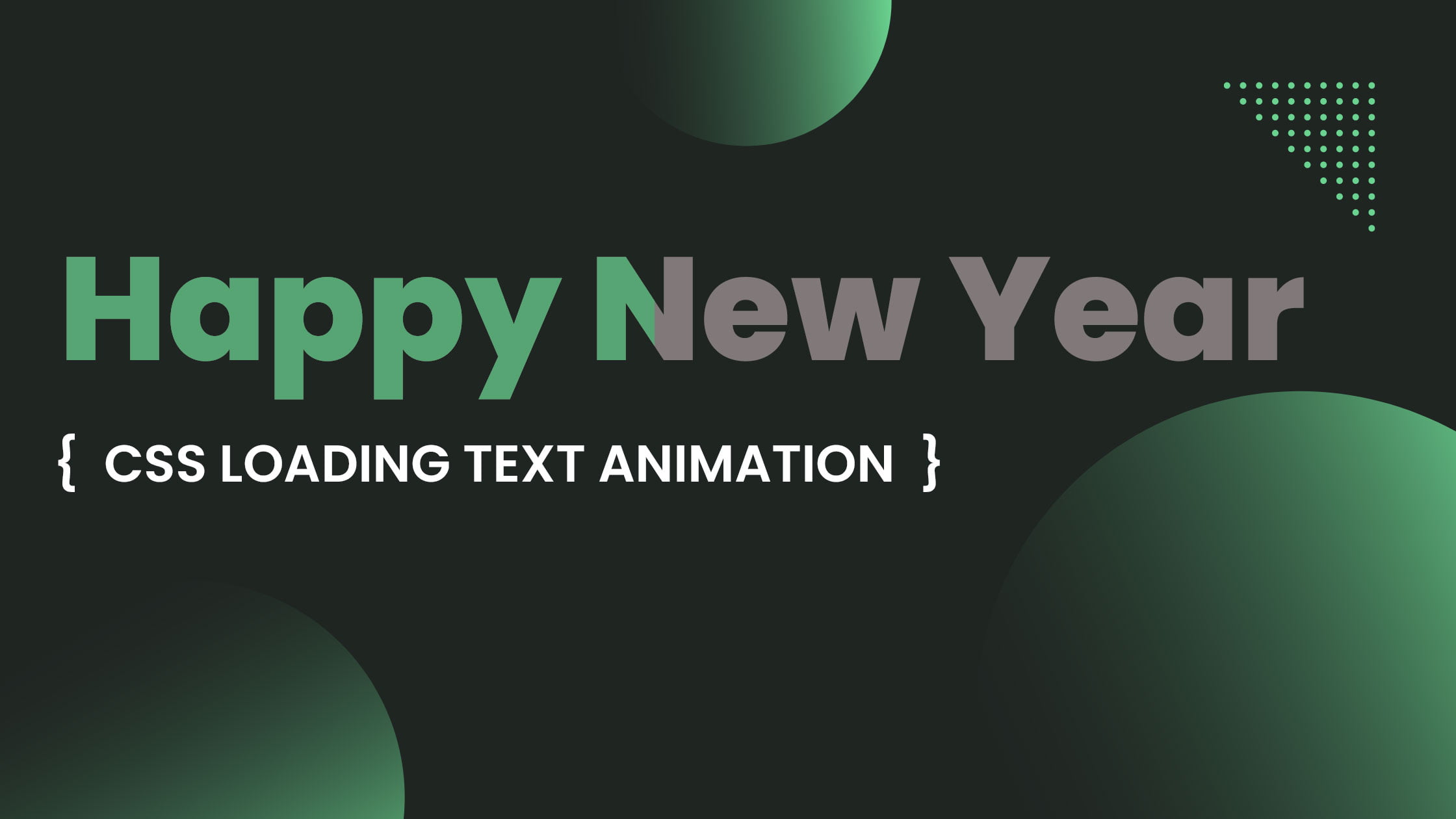
CSS loading text animation effects can be used to indicate to users that content is loading on a website or application. These types of animations can help to improve the user experience by providing visual feedback while the content is being loaded.
There are a variety of ways to create loading text animations using CSS. One simple method is to use the animation property in conjunction with the @keyframes rule. The animation property allows you to specify the duration, iteration count, and timing function of the animation, while the @keyframes rule defines the specific style changes that occur throughout the animation.
One simple way to create a loading text animation effect is to use the animation property in CSS. The animation property allows you to specify a set of animation keyframes, which define the start and end states of the animation. You can then specify the duration of the animation and any delays or iterations.
Table of Contents
Here is an example of a basic loading text animation that fades in and out:
@keyframes fadeInOut {
  0% {
    opacity: 0;
  }
  50% {
    opacity: 1;
  }
  100% {
    opacity: 0;
  }
}

.loading-text {
  animation: fadeInOut 2s infinite;
}
In this example, the fadeInOut animation has a duration of 2 seconds and will repeat indefinitely (as indicated by the infinite value for the animation-iteration-count property). The @keyframes rule specifies that the opacity of the element should start at 0, increase to 1 at the halfway point, and then decrease back to 0 at the end of the animation.
Another common technique for creating loading text animations is to use the ::before and ::after pseudo-elements to add additional content to the text element. This can be used to create a variety of effects, such as text that appears to be typing or text that appears to be loading from left to right.
.loading-text {
  position: relative;
  overflow: hidden;
}

.loading-text::before {
  content: "";
  position: absolute;
  width: 100%;
  height: 100%;
  background: linear-gradient(to right, transparent, #fff 50%, transparent);
  animation: typing 2s infinite;
}

@keyframes typing {
  0% {
    left: 0;
  }
  100% {
    left: 100%;
  }
}
In this example, the ::before pseudo-element is used to create a white bar that appears to be typing the text. The typing animation moves the bar from left to right, giving the appearance of a cursor typing out the text.
You can also use the animation-delay property to create more complex loading text animations. For example, here is a loading text animation that types out the text one letter at a time:
.loading-text {
  display: inline-block;
  position: relative;
  overflow: hidden;
}

.loading-text::before {
  content: "";
  position: absolute;
  width: 100%;
  height: 100%;
  background: linear-gradient(to right, transparent, #fff 50%, transparent);
  animation: typing 2s infinite;
}

@keyframes typing {
  0% {
    left: 0;
  }
  100% {
    left: 100%;}
}
Another way to create a loading text animation effect is to use the animation-delay property. The animation-delay property allows you to specify a delay before the animation starts. This can be useful for creating a more realistic typing effect, as it allows you to specify different delays for each character.
For example, let’s say you want to create a loading text animation effect that makes the text appear to be typing out the word “LOADING…” with a delay between each character. To do this, you can use the animation property with the @keyframes rule to define the start and end states of the animation, and the animation-delay property to specify a delay for each character.
Here HTML code
<!DOCTYPE html>
<html>
<head>
<title>www.stakedesigner.com</title>
<meta charset="UTF-8">
<meta http-equiv="X-UA-Compatible" content="IE=edge">
<meta name="viewport" content="width=device-width, initial-scale=1.0">
<link rel="icon" href="assets/img/favicon.png" sizes="32x32" type="image/png">
<link rel="stylesheet" href="assets/css/style.css">
</head>
<div class="aniamtion-block">
   <span data-text="Happy">Happy</span>
   <span data-text="New">New</span>
   <span data-text="Year">Year</span>
</div>
<body>
</body>
</html>
CSS code
* {
  margin: 0;
  padding: 0;
  box-sizing: border-box;
}

body {
  font-family: Arial, Helvetica, sans-serif;
  font-size: 80px;
  background-color: black;
  height: 100vh;
  display: flex;
  align-items: center;
  justify-items: center;
  justify-content: center;
}

.aniamtion-block span {
  position: relative;
  color: rgba(255, 255, 255, 0.6);
  line-height: normal;
  font-weight: bold;
}

.aniamtion-block span::after {
  content: attr(data-text);
  color: blue;
  position: absolute;
  left: 0;
  overflow: hidden;
  width: 100%;
  animation: textanimation 3s normal both;
}

/* Aniamtion */
@keyframes textanimation {
  0% {
    width: 0%;
  }
  100% {
    width: 100%;
  }
}

.aniamtion-block span:nth-child(1)::after {
  animation-delay: 0s;
}

.aniamtion-block span:nth-child(2)::after {
  animation-delay: 1.8s;
}

.aniamtion-block span:nth-child(3)::after {
  animation-delay: 3.8s;
}


