Introducing Flexbox, How to Master Using Flexbox in CSS for website the powerful CSS layout system that empowers you to effortlessly create flexible and responsive designs. In this extensive guide, we will explore the intricacies of Flexbox, catering to both beginners and experienced developers alike. By the time you finish this tutorial, you will have gained the expertise and techniques required to become a true master of Flexbox. Let’s embark on this journey together and begin unlocking the full potential of Flexbox!
Table of Contents
Understanding the Basics – How to Master Using Flexbox in CSS
1.What is Flexbox?
Flexbox stands out as a remarkable CSS module that presents distinct and adaptable approach to aligning elements within a container. It introduces a singular one-dimensional layout model, the versatility to arrange elements either horizontally in a row or vertically in a column. This section will uncover the fundamental concepts and terminology linked to Flexbox, providing you with a fresh perspective on this innovative technique for web design
2.Flex Container
The container, or the parent element, becomes a flex container by applying the CSS property display: flex; or display: inline-flex; if you want the container to behave like an inline element. Once this property is applied, the direct children of the container become flex items.

Example:
HTML:
<div class="container">
  <div class="item">Item 1</div>
  <div class="item">Item 2</div>
  <div class="item">Item 3</div>
</div>
CSS
.container {
  display: flex;
}
3.Flex Wrap
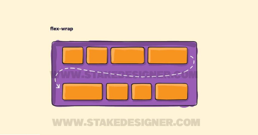
By default, flex items are laid out in a single line. However, the flex-wrap property allows you to control whether the items should wrap to multiple lines or not. It can have three values: nowrap (default), wrap, and wrap-reverse.
Example:
CSS:
.container {
  display: flex;
  flex-wrap: wrap;
}
4.Justify Content
The justify-content property determines how the flex items are aligned along the main axis (horizontal axis by default). It offers various alignment options such as flex-start (default), flex-end, center, space-between, space-around, and space-evenly.
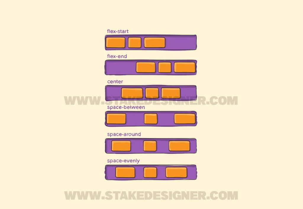
Example:
CSS:
.container {
  display: flex;
  justify-content: center;
}
5.Align Items
The align-items property controls the alignment of flex items along the cross axis (vertical axis by default). It allows you to position items using values like flex-start, flex-end, center, baseline, and stretch.
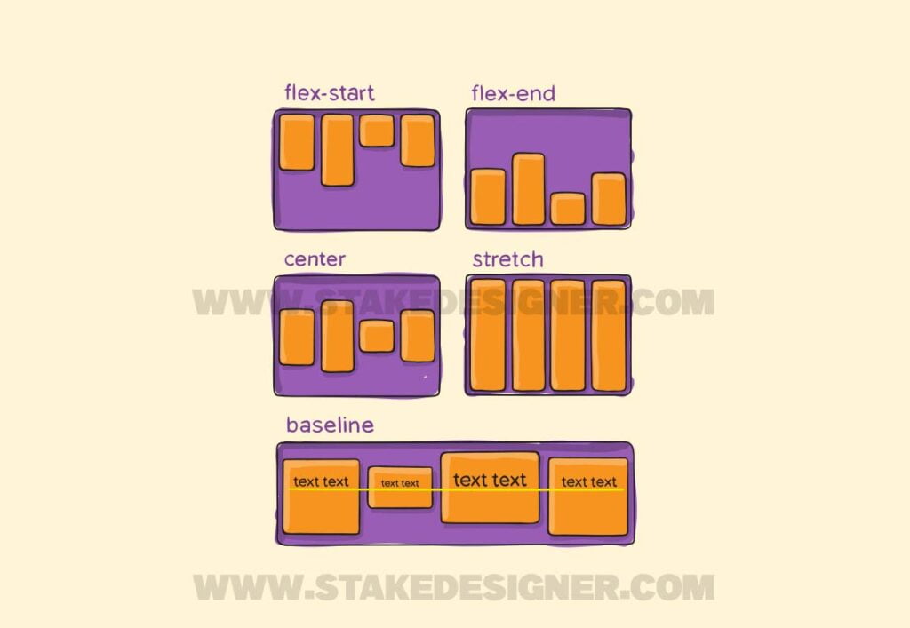
Example:
CSS:
.container {
  display: flex;
  align-items: center;
}
6.Align Content
The align-content property works similarly to align-items, but it applies to multiple lines of flex items. It determines how the lines are aligned along the cross axis. The possible values are flex-start, flex-end, center, space-between, space-around, and stretch
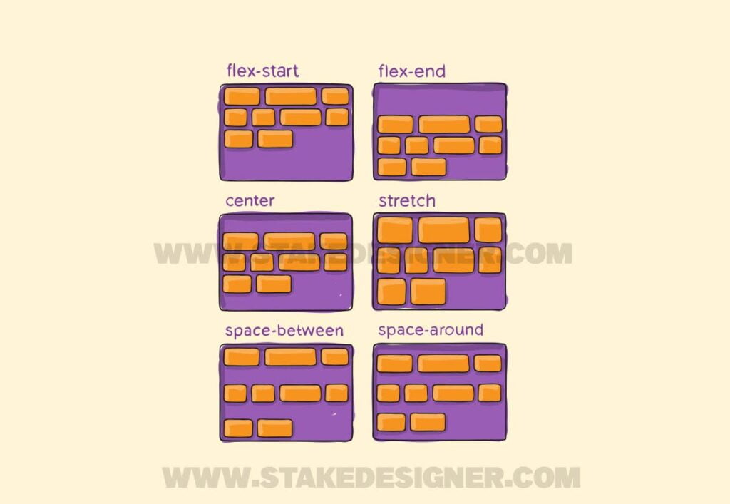
Example:
CSS:
.container {
  display: flex;
  flex-wrap: wrap;
  align-content: center;
}
7.Flex Items
The individual elements inside the flex container are called flex items. You can control their behavior using various properties.
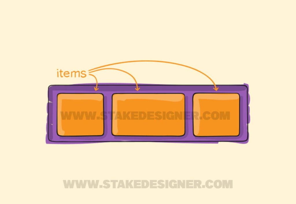
Example:
CSS:
.item {
  flex-grow: 1;
  flex-shrink: 1;
  flex-basis: 200px;
}
In the above example, flex-grow determines how much an item can grow relative to other items, flex-shrink determines how much an item can shrink relative to other items, and flex-basis specifies the initial size of the item.
