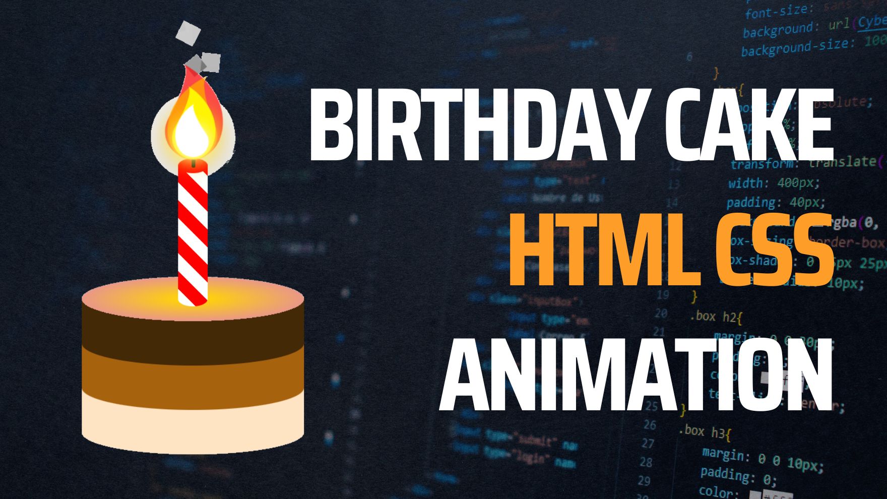
To create the Birthday Cake and Candles Animation using HTML, CSS, and jQuery, follow the steps outlined in the video tutorial below.
CSS (Cascading Style Sheets) is a language that is used to style and layout web pages. It allows you to control the appearance of elements on a web page, such as colors, fonts, and positioning. CSS animations are a powerful tool that can bring your website to life and add a touch of fun and creativity.
In this tutorial, we will walk through the steps of creating a simple birthday cake animation using CSS. The final result will be a cake with flickering candles that can be used on a birthday greeting card or website.
Here is a preview of what the final animation will look like:
Table of Contents
Happy birthday to you, happy birthday to you! What better way to celebrate a birthday than with a virtual birthday cake? In this tutorial, we will be using CSS to create a fun and interactive birthday cake animation.
1 – First Birthday Cake – CSS Animation Example
To start, we will need to create the HTML structure for our cake. We will create a div with the class cake-container to hold our cake and candles. Inside of this div, we will create a div with the class cake to represent the actual cake. For the candles, we will create a ul with the class candles and add li elements for each candle.
<div class="cake-container">
  <div class="cake">
    <!-- cake layers go here -->
  </div>
  <ul class="candles">
    <li></li>
    <li></li>
    <li></li>
    <!-- more candles -->
  </ul>
</div>
Next, we will style our cake using CSS. We will set the width and height of the cake div and give it a round shape using the border-radius property. We will also give it a gradient background using the linear-gradient function.
.cake {
  width: 200px;
  height: 200px;
  border-radius: 50%;
  background: linear-gradient(to bottom, #f8b195, #f67280);
}
Now, let’s add some layers to our cake. We can do this by creating additional div elements inside of the cake div and giving them a smaller width and height and a higher z-index. We will also give them a different gradient background color to give the illusion of layers.
<div class="cake-container">
  <div class="cake">
    <div class="layer layer-1"></div>
    <div class="layer layer-2"></div>
    <div class="layer layer-3"></div>
  </div>
  <!-- candles -->
</div>
.layer {
  position: absolute;
  width: 180px;
  height: 180px;
  border-radius: 50%;
  z-index: 1;
}

.layer-1 {
  background: linear-gradient(to bottom, #f8b195, #f67280);
  z-index: 3;
}

.layer-2 {
  background: linear-gradient(to bottom, #c06c84, #6c5b7b);
  z-index: 2;
}

.layer-3 {
  background: linear-gradient(to bottom, #355c7d, #6c5b7b);
  z-index: 1;
}
Now for the fun part – the candles! We will style the li elements to look like candles using the ::before and ::after pseudo-elements. We will give the li elements a height and a background-color and then use the pseudo-elements to create the flame shape.
*to see the animation on the website click here.
2 – First Birthday Cake – CSS Animation Example
Let’s get started!
Step 1: Set up the HTML structure
First, we need to set up the basic HTML structure for our animation. Create a new HTML file and add the following code:
<!DOCTYPE html>
<html>
<head>
<title>www.stakedesigner.com</title>
<meta charset="UTF-8">
<meta http-equiv="X-UA-Compatible" content="IE=edge">
<meta name="viewport" content="width=device-width, initial-scale=1.0">
<link rel="icon" href="assets/img/favicon.png" sizes="32x32" type="image/png">
<link rel="stylesheet" href="assets/css/style.css">
</head>

<body>
    <div class="wrapper">
        <div class="cake">
             <div class="lyr lyr-1"></div>
             <div class="lyr lyr-2"></div>
             <div class="lyr lyr-3"></div>
        </div>
        <div class="candle"></div>
        <div class="fram">

            <div class="smoke smk-1"></div>
            <div class="smoke smk-2"></div>
            <div class="smoke smk-3"></div>
            <div class="smoke smk-4"></div>
            <div class="smoke smk-5"></div>

            <div class="flm-part red fliped"></div>
            <div class="flm-part orange"></div>
            <div class="flm-part yellow fliped"></div>
            <div class="flm-part white"></div>

        </div>
    </div>
</body>
</html>
This code creates a div element with the class “cake” which will be the container for our animation. Inside it, we have a div element with the class “wrapper” which will hold the different layers of the cake. Each layer is represented by a div element with the class “lyr ” and a number to distinguish them. We also have a div element with the class “candle” which will contain the individual candle elements. Each candle is represented by a div element with the class “candle”.
Step 2: Add some basic styling with CSS
Now that we have the basic HTML structure in place, let’s add some basic styling to our elements using CSS. In your CSS file, or in a style tag in the head of your HTML file, add the following code:
body {
  background-image: linear-gradient(#fff,#bbb);
  height: 100vh;
  display: flex;
  justify-content: center;
  align-items: center;
}

.wrapper {
  position: relative;
  width: 240px;
  height: 480px;
}

.cake {
  position: absolute;
  bottom: 0;
}

.lyr {
  width: 240px;
  height: 96px;
  position: absolute;
  background-color: currentColor;
  border-radius: 120px / 24px ;
}

.lyr-1 {
  color: bisque;
  bottom: 0;
}

.lyr-2 {
  color: rgb(167, 98, 14);
  bottom: 48px;
}

.lyr-3 {
  color: rgb(68, 41, 7);
  bottom: 96px;
  background-image: radial-gradient(ellipse 7.5rem 1.5rem at 7.5rem 1.5rem, gold, gold 5%, #E99788 100%, transparent);
}

.candle {
  position: absolute;
  background-color: red;
  width:32px;
  left: 104px;
  height: 160px;
  bottom: 160px;
  border-radius: 20px / 10px;
  background-image: repeating-linear-gradient(45deg, white, white 10%, transparent 10%, transparent 20%);
}

.candle::before {
  content: '';
  position: absolute;
  background-color: black;
  width: 4px;
  height: 32px;
  border-radius: 4px / 2.4px;
  left: 15px;
  top: -22px;
}

.candle::after {
   background-color: red;
   display: block;
   content: '';
   width: 32px;
   height: 16px;
   border-radius: 50%;
}

.fram {
  position: absolute;
  left: 104px;
}


.smoke {
  color: currentColor;
  background-color: currentColor;
  top: 125px;
  width: 6px;
  height: 6px;
  position: relative;
  animation-name: burn-smoke;
  animation-timing-function: ease-out;
  animation-iteration-count: infinite;
}

.smk-1 {
  left: 8px;
  animation-duration: .5s;
}

.smk-2 {
  left: -8px;
  animation-duration: .6s;
}

.smk-3 {
  left: 16px;
   animation-duration: .7s;
}

.smk-4 {
  left: 24px;
  animation-duration: .8s;
}
.smk-5 {
  left: 32px;
  animation-duration: .9s;
}


.flm-part {
  background-color: currentColor;
  border-color: currentColor;
  width: 32px;
  height: 32px;
  border-radius: 50%;
  position: relative;
  transform: rotate(60deg) skewX(0deg) scale(1);
  animation-timing-function: linear;
  animation-iteration-count: infinite;
}

.flm-part.fliped {
  transform: rotate(120deg) skewX(0deg) scale(1);
}

.flm-part::before {
  content: '';
  position: absolute;
  border-radius: 0 0 0 100%;
  border-bottom-style: solid;
  border-bottom-color:inherit;
  border-bottom-width: 32px;
  width: 32px;
  height: 8px;
  left: -16px;
  top: -8px;
}

.flm-part.fliped::before  {
  border-radius: 100% 0 0 0;
  border-bottom: 0 solid transparent;
  border-top-style: solid;
  border-top-color: inherit;
   border-top-width:32px;
   width: 32px;
  height: 8px;
  left: -16px;
  top: 0px;
}

.red {
  color: red;
  top: 84.4px;
  opacity: 0.7;
  animation-name: burn-red;
  animation-duration: 1s;
}

.orange {
  color: orange;
  top: 57px;
  opacity: 0.8;
  box-shadow: 0 0 16px orange;
   animation-name: burn-orange;
  animation-duration: 0.4s;
}

.yellow {
  color: yellow;
  top: 28px;
  opacity: 0.9;
  box-shadow: 0 0 16px yellow;
   animation-name: burn-yellow;
  animation-duration: 1.6s;
}

.white {
  color: white;
  box-shadow: 0 0 16px white;
   animation-name: burn-white;
  animation-duration: 1.8s;
}


@keyframes burn-smoke {
  0% { transform: rotate(0deg) scale(1);  opacity: 1; }
  100% {transform: rotate(360deg) scale(4); opacity: 0; top: 0;}
}

@keyframes burn-red {
  0% { transform: rotate(120deg) skewX(0deg) scale(1.8)}
  20% { transform: rotate(118deg) skewX(5deg) scale(2)}
  40% { transform: rotate(120deg) skewX(0deg) scale(1.8)}
  60% { transform: rotate(122deg) skewX(-5deg) scale(2)}
  100% { transform: rotate(120deg) skewX(0deg) scale(1.8)}
}

@keyframes  burn-white {
  0% { transform: rotate(60deg) skewX(0deg) scale(1)}
  20% { transform: rotate(50deg) skewX(-3deg) scale(1.1)}
  40% { transform: rotate(60deg) skewX(0deg) scale(1)}
  60% { transform: rotate(70deg) skewX(3deg) scale(1.1)}
  100% {transform: rotate(60deg) skew(0deg) scale(1)}
}

@keyframes burn-yellow {
  0% { transform: rotate(120deg) skewX(0deg) scale(1.4)}
  20% { transform: rotate(110deg) skewX(10deg) scale(1.5)}
  40% { transform: rotate(120deg) skewX(0deg) scale(1.4)}
  60% { transform: rotate(130deg) skewX(-10deg) scale(1.5)}
  100% {transform: rotate(120deg) skew(0deg) scale(1.4)}
}

@keyframes burn-orange {
  0% { transform: rotate(65deg) skewX(0deg) scale(1.6)}
  20% { transform: rotate(60deg) skewX(-15deg) scale(1.7)}
  40% { transform: rotate(65deg) skewX(0deg) scale(1.6)}
  60% { transform: rotate(70deg) skewX(2deg) scale(1.7)}
  100% {transform: rotate(65deg) skew(0deg) scale(1.6)}
}
If you would like to download click below


